

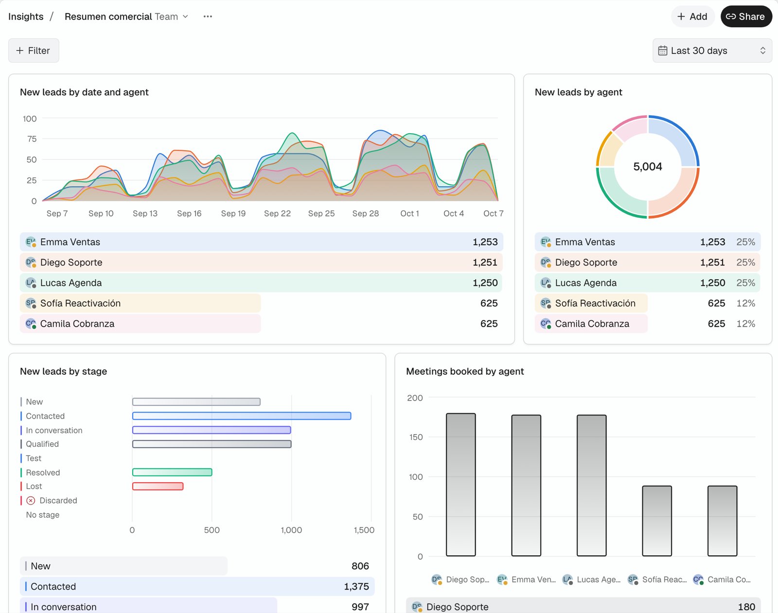
What you can chart
The Team group charts performance per executive, with the same numbers as Settings > Team: Messages sent, Leads assigned, Escalations resolved, Overdue escalations and First reply (median minutes). These metrics split only by executive and cover up to 92 days.
Split any metric by Date, Agent, Stage or Executive (the lead’s assigned person), or show it as one number. Dates use your workspace’s time zone.
Not available yet: messages, reply rate, calls, meetings held and custom lead fields. Ask Nexor AI for those; its answer still works, but the chart cannot be saved.
Save a chart from Nexor AI
- Ask Nexor AI, for example “new leads this month by agent”.
- On the chart, click the bookmark button.
- Pick a dashboard, or create one. Your first dashboard is called General by default, and Insights appears in the sidebar.
Build a dashboard
- Add, at the top right next to Share, opens the editor: pick a metric, Show by, Split by for an optional breakdown, filters and the chart type. For Bars, Flip axes draws them horizontally. The preview uses the dashboard’s dates and filters.
- Hover a chart’s title to see how its metric is counted.
- Drag a chart by its handle to reorder it; an outline shows where it will land. Drag either edge, or use the arrow keys on it, to make it wider or narrower.
- The chart footer lists every category with its color and value, and pie charts add each share. Hover a row to highlight its part of the chart, or hover the chart to highlight its row. Each row also shows its change versus the previous period of the same length, and the footer shows the goal and the total change.
- Click a row, a bar or a donut slice to see the leads behind that number, with the same dates and filters, and open any of them. Team metrics are not counted per lead, so their rows do not open a list.
- When a bar chart gets narrow, it draws horizontally so names stay readable.
- Filter and the date menu above the charts apply to every chart and are yours: they are kept for you on that dashboard, so on a team dashboard each person sees their own filters and dates. Today and Yesterday are not compared with the previous period.
- When the period has no data, charts show zero.
- Select an active filter to change its value, or use its close button to remove it.
- Each chart’s menu has Edit, Duplicate and Remove.
- Insights opens the last dashboard you viewed.
- The dashboard menu beside its name has New dashboard, Rename, Duplicate and, for the owner, Delete.
Ask Nexor AI about a chart
In any chat with Nexor AI, type @, pick a dashboard and then one of its charts. Nexor AI reads that chart with its dates and filters and answers about those numbers. You can also type part of a chart’s name after @ to find it directly.Share
If someone else owns a Team dashboard, use Make a private copy in Share to create your own private version.
Human agents do not have access to Insights.
API and MCP
The same numbers are available to integrations through the public API, and to Nexor AI through thequery_insights MCP tool, with the reports:read scope.
Frequent questions, such as “how many leads are still uncontacted” or “meetings this week”, use one fixed chart per question, so the same question always returns the same chart. Relative periods (today, this week, last 30 days) are computed in your workspace’s time zone.